It’s one thing to increase the number of leads, but how do we know that these are quality leads?
After delivering a 49% increase in leads for a fintech client, this data visualization project was meant to demonstrate this result—as well as to show how their current system was handling this influx.
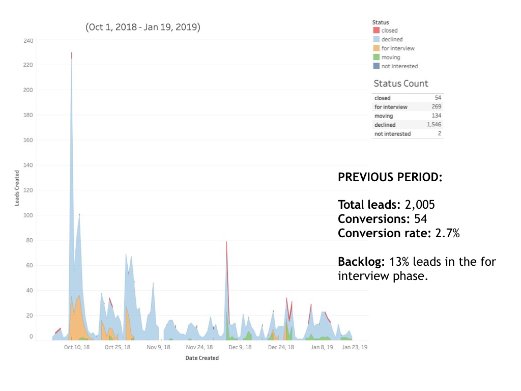
This was important because the conversion rate had fallen, and we needed to investigate why. The data showed that this was caused by a 46% internal backlog in the client’s sales team in processing the additional leads. With most of the applicants yet to be evaluated, it was hard to see how well of a job we were doing in terms of the quality of leads we were bringing in.
The data was taken from the client’s CRM over eight months. The statuses for leads in the database were a lot more granular. For the sake of simplicity, I narrowed down 31 statuses into 6: (leads that had yet to be contacted, to be interviewed, leads that were moving down the funnel, leads that have been closed/converted, those who had been declined, and those who weren’t interested).
For comparison, we started by visualizing the period before the client contracted our services.
We then demonstrated the results we were able to bring in.


The next steps are internal with the client. Once they process additional leads, we can get a more conclusive conversion rate and evaluation of the quality of the increased traffic.
This would then make it possible to look into more descriptive factors, such as the most notable reasons for being declined. What are the profiles of those who convert? This information would be useful for the next round of ad targeting.
I used Python to clean and analyze the data and Tableau for visualization.
